Navigation And Responsive Patterns
Source: navigation.md
Navigation & Layout Components
This section covers navigation patterns, footer designs, and general layout components used across the application.
Navigation Menus
Coming soon - main navigation and menu components
Footer Designs
Desktop Footers
Coming soon - footer component variations
Mobile Footers
Coming soon - mobile-optimized footer designs
Search & Discovery
Coming soon - search interfaces and discovery patterns
Table of Contents
TOC Implementation
Sharing Components
Coming soon - social sharing and content distribution interfaces
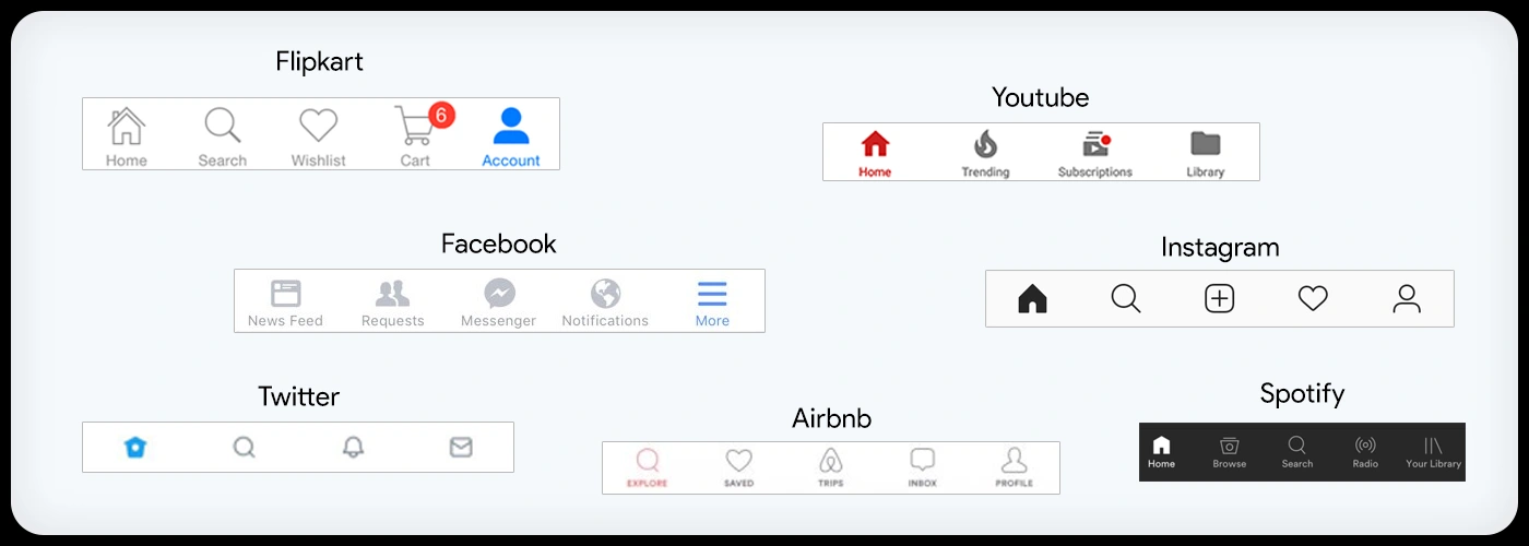
Source: mobile-footers.md
Mobile Footers
Source: loading-spinner.md
<div class="spinner-border text-primary" role="status">
  <span class="visually-hidden">Loading...</span>
</div>
The loading spinner is an essential part of user experience (UX) because it's a form of system feedback that addresses a fundamental psychological need: the need for confirmation and reassurance.^1^
Here's a breakdown of why it's so crucial:
1. Reduces Uncertainty and Anxiety^2^
When a user clicks a button or performs an action, they expect a response.^3^ If the system has to take a moment to process that request---whether it's fetching data, submitting a form, or performing a complex calculation---a period of "dead air" can be very unsettling. The user might wonder:
-
Did my click even register?
-
Is the page frozen?
-
Is my internet connection down?
-
Did I do something wrong?^4^
A loading spinner provides immediate visual feedback that the system has received the request and is actively working on it.^5^ This simple animation reassures the user that everything is functioning as it should be, alleviating anxiety and preventing them from taking a frustrating action like clicking the button multiple times or closing the page entirely.^6^
2. Manages User Expectations and Perceived Wait Time
While a spinner doesn't tell the user how long they'll have to wait (that's a job for a progress bar), it does a great job of managing the perception of that wait time. A blank screen feels longer than a screen with an engaging animation. The spinner occupies the user's attention, making the delay feel less tedious and more manageable.^7^
3. Prevents User Errors and Accidental Actions
In certain scenarios, a spinner is used to signal that the UI is temporarily disabled. For example, after a user submits a form, a spinner often appears, sometimes with the submit button being disabled. This prevents the user from accidentally double-clicking or resubmitting the form, which could lead to errors like duplicate purchases or multiple data entries.
4. Provides a Contextual Cue^8^
A well-designed loading spinner or a more elaborate loading screen can also provide contextual information. Instead of just a generic spinning circle, you might see a "Processing your payment..." or "Fetching the latest news..." message. This informs the user about what's happening in the background, further managing their expectations and making the wait feel more purposeful.^9^
Key Considerations for Good Spinner UX
-
Don't show it for too-short tasks: If a task takes less than a second, a spinner can actually feel jarring and make the experience seem slower.^10^ A good UX principle is to only show the spinner for tasks that exceed a certain threshold (e.g., 0.5 to 1 second).
-
Don't leave it running indefinitely: For longer tasks (over 10 seconds), a simple spinner might not be enough.^11^ The user may start to wonder if something is wrong.^12^ For these cases, a progress bar with a percentage or an estimated time remaining is a better choice. You should also have a timeout and a clear error message in case the request fails.^13^
-
Design matters: A unique and branded loading animation can turn a potentially negative waiting experience into a positive and memorable one, reinforcing your product's identity.^14^
In short, a loading spinner is a small but powerful tool.^15^ It's not just a decorative element; it's a critical piece of communication that helps build trust, reduce frustration, and create a smoother, more human-centered interaction.^16^
Source: breakpoints.md
Breakpoints & Responsive Design
This section covers responsive design patterns and breakpoint implementations for both desktop and mobile experiences.
Desktop Breakpoint Components
Table of Contents

Navigation & Footers
Coming soon - consolidated navigation and footer components
Content Layouts
Coming soon - various page layouts and content structures
Mobile Breakpoint Components
Mobile Footers
Coming soon - mobile-specific footer implementations
News Feed
Coming soon - mobile news feed components
Responsive Interactions
Coming soon - touch-friendly interactive elements
Source: responsive-web-design.md
Responsive Web Design
Breakpoints
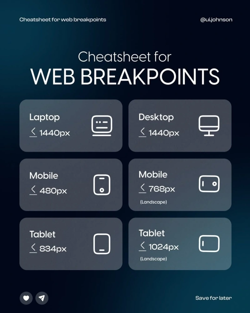
Related Responsive Design Images


