CSS
Table of Contents
- Terms
- Media Types
- Properties
- Common Screen Resolutions
- Dark Mode
- Class Naming Conventions
- CSS Selectors
- Attribute Selectors
- Pseudo-Class
- Pseudo Elements
- Snippets
- Best Practices
box model
the order of the box model from inside out
content, padding, border, margin

CSS container queries
CSS container queries are a new feature in CSS that allow you to apply styles to an element based on the size of its container, rather than the size of the viewport. This feature provides more flexibility and control when creating responsive designs.
In the article "Say Hello To CSS Container Queries" by Ahmad Shadeed, the author explains the limitations of using CSS media queries for responsive web design. While media queries are useful for adapting the layout based on the viewport or screen size, they don't directly address the issue of adapting components based on their container size.
The article provides an example of a card component that can be displayed in either a stacked or horizontal layout. The author demonstrates how this can be achieved using media queries based on the viewport width. However, they also point out that this approach is limited because it doesn't take into account the width of the component's parent container.
CSS container queries offer a solution to this problem. With container queries, you can define styles that respond to changes in the width of the element's container. This allows you to create more flexible and adaptive components that adjust based on their parent container's size.
To use container queries, the article explains that you need to enable the feature in Chrome Canary by going to chrome://flags and searching for "container queries". Once enabled, you can start experimenting with container queries.
The first step is to specify the container-type property on the element you want to apply container queries to. The container-type property with the value "inline-size" indicates that the element should respond to changes in its parent's width. This helps the browser optimize rendering by only repainting the affected area, rather than the whole page.
Next, you can define styles within an @container rule to apply when certain conditions are met. These conditions are based on the width of the element's container. For example, you can use the @container (min-width: 400px) rule to specify styles that should be applied when the container's width is at least 400 pixels.
The article provides examples of various use cases for container queries. One example is using container queries with CSS grid's auto-fit property. By combining container queries with grid layouts, you can create responsive grids where the components adjust based on their parent grid item's width.
Another example is adapting a component, such as a newsletter section, to different container sizes. With container queries, you can easily modify the component's layout and styles based on whether it's placed in an <aside> or the main section of a page.
Overall, CSS container queries offer a powerful way to create more adaptive and responsive designs by allowing styles to be based on the size of an element's container. It provides more flexibility in handling layout variations and reduces the reliance on viewport-based media queries.
Best Practices
whether to use pixels or ems/rems
the differences between pixels, ems, and rems and their impact on accessibility Pixels are the most concrete unit in CSS and are often used for things like borders and shadows. Ems are relative to the font size of the parent element and can be used to create a proportional scaling effect. Rems are similar to ems, but they are always relative to the root element (usually the HTML tag) and are not affected by inheritance.
- both pixels and ems/rems have their place in CSS and that a strategic deployment of units is necessary to ensure accessibility
- the importance of using relative units like ems and rems for typography to allow users to adjust font sizes as needed.
- the question of whether to use pixels or ems/rems in CSS, which is a common question among web developers.
- both units have their advantages and disadvantages, and that a strategic deployment of units is necessary to ensure accessibility.
- detail about the differences between pixels, ems, and rems.
- of accessibility in web development and explains how font size can impact accessibility.
- using relative units like ems and rems is important for typography to allow users to adjust font sizes as needed
- discusses the difference between zooming and font scaling and explains why font scaling is important for accessibility.
- tips and tricks for converting between units and building a mental model for deciding which unit to use in a given situation.
- both pixels and ems/rems have their place in CSS, and that a strategic deployment of units is necessary to ensure accessibility.
nth-child selector is brittle
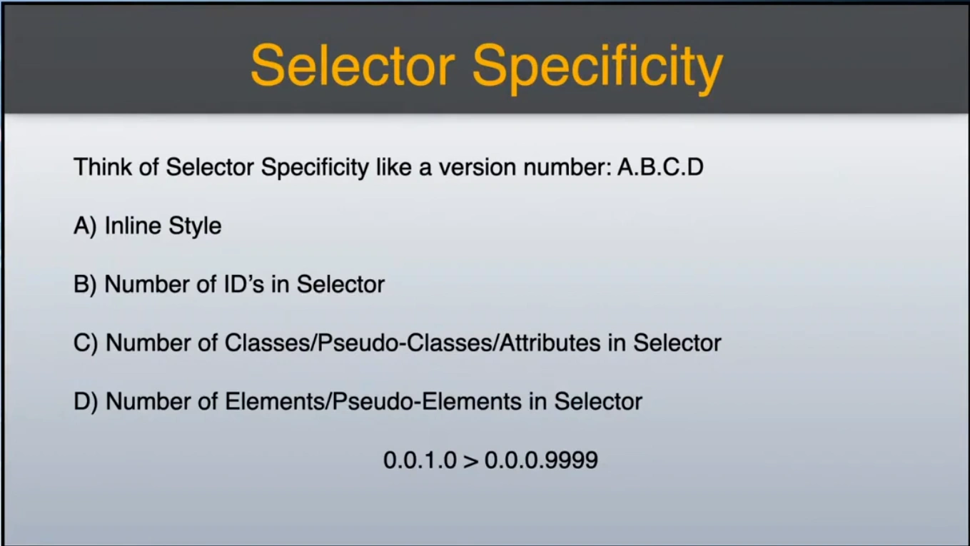
CSS selectors impact on performance, questioning long-held beliefs about which selectors are "fast" or "slow."
-
Selector Speed: The author conducted tests across various modern browsers to measure the speed of different CSS selectors on a large DOM. Results indicated that while some selectors performed better than others, the differences were minor and varied by browser.
-
CSS Architecture: Frain emphasizes that good CSS architecture is more important than the specific selectors used. He argues that a flat hierarchy of class-based selectors is often more efficient.
-
Unused Styles: The presence of excessive unused styles in CSS files can significantly degrade performance. The article suggests that simplifying and cleaning up styles can have a greater impact on performance than optimizing selectors.
-
Expensive Properties: Certain CSS properties (like box-shadow and transforms) can lead to performance issues, particularly during rendering and repainting. He advises focusing on these properties for optimization.
-
Conclusion: Developers should prioritize reducing bloat and avoiding expensive styles over obsessing about selectors, as the latter have less impact on overall CSS performance.
developers should test their CSS in various browsers and keep their stylesheets tidy for better performance.
Terms
stylesheet | combinator | selectors |
Media Types
all: This media type applies to all devices.screen: This media type applies to computer screens, tablets, and smartphones in portrait and landscape modes.print: This media type applies when a document is printed or viewed in print preview mode.speech: This media type applies to screen readers and other speech synthesis devices.handheld: This media type applies to handheld devices such as smartphones and small tablets.tv: This media type applies to television-type devices.projection: This media type applies to projectors.braille: This media type applies to braille feedback devices.embossed: This media type applies to paged braille printers.
Properties
CSS properties, associated with values, form declarations. Declaration blocks, assigned with selectors, form rule sets. They are used as follows:
selector {
            property: value;
        }

/* or, for with more selectors and values... */

selector1, selector2, selector3 {
    property1: value1;
    property2: value2;
    property3: value3;
}
- A property is an aspect of a selector. For instance, you can change the font-family, color, and font-size of the text on your web pages (in addition to many more).
- A value is a possible setting for a property. color can be red, blue, black, or almost any color; font-family can be a whole bunch of different fonts; and so on.
- You need to end each property-value with a semi-colon (;). That's how CSS knows you're done with one pair and ready for the next.
currentColor
a keyword that lets you refer to the current value of the color property on an element.
Here's what currentColor does:
- Inherits color:
currentColoracts like a variable for the color property. It takes the value of thecolorproperty defined on the element itself, or inherits it from a parent element if not explicitly set. - Consistent colors: Use
currentColorto ensure elements have consistent colors across different properties. For example, set the border color tocurrentColorof the text to create a matching border. - Centralized control: If you change the text color, all elements using
currentColorwill automatically update, maintaining consistency.
There are some things to keep in mind with currentColor:
- Not a true variable: It's not the same as a CSS custom property (variable). It specifically references the
colorproperty. - Limited use cases: Setting the text color to
currentColorwon't work as it would result in invisible text (same color for background and text).
Overall, currentColor is a handy tool for maintaining consistent color schemes within your CSS styles.
clippath calc(...) CSS function
Common Screen Resolutions
Device Viewports
https://deviceatlas.com/blog/list-of-user-agent-strings
Common Screen Resolutions
- 24% 750x1334 Apple iPhone 6s
- 20% 1080x1920 Apple iPhone 8 Plus
- 6.7% 828x1792 Apple iPhone XR
- 6.5% 1080x2076 Samsung Galaxy S9 SM-G960U
- 6.5% 1125x2436 Apple iPhone X
- 4.8% 1080x2094 Samsung Galaxy S9+
- 4% 720x1280 Samsung Galaxy J7 V (and a few other phones are also this size)
Top Screen Resolutions
360 x 640
1366 x 768
1920 x 1080
375 x 667
Responsive Image Breakpoints
| Width | Width |
|---|---|
| xtra small | 480px |
| tablet | 768px |
| Ipad / Tablet | 1024px |
| Desktops / Laptops | 1280px |
| TV / Large Screen | 1920px |
https://github.com/edent/SuperTinyIcons/
Dark Mode
https://ionic.io/blog/hot-take-dark-mode
HTML Meta Tags for Dark Mode
<meta name="color-scheme" content="light dark">
<meta name="supported-color-schemes" content="light dark">
CSS for Dark Mode
@media (prefers-color-scheme: dark) {
Class Naming Conventions
https://medium.com/@drublic/css-naming-conventions-less-rules-more-fun-12af220e949b
Regarding variables, functions and mixins, we stick to something very CSS-y: lowercase hyphen-delimited, and above all meaningful.
FORMAT: prefix-ComponentName-elementName--state
Anatomy of a Class Name
- App-specific prefix (lowercase) followed by a single dash, e.q. appname-. This aligns with the upcoming proposal to use a unique, app-specific class prefix for each app cation. Sales UI will keep Las-, LMDS uses lm-/1mig-. This will prevent collisions between apos wihininc module federation shell
- ComponentName (title case), .a. ExampleComponent. This should match the name of the containing component. Using the component name creates a safe namespace for the styles targeting that component, and should prevent any styles in one component from impacting another. For axample the outermost wrapper element of a component will likely have the class appnaze-Examplecorponent
The important things to note here are:
- All sub elements still use the prefix and component name at the start of each class. This prevents conflicts, and makes it clear where this class is coming from when inspecting the DOM.
- Sub elements only have one piece of camel-case text after the component name. E.g. neptune-DiscountCard-titleIconWrapper is preferred over -neptune- DiscountCard-title-icon-wrapper.
- It's up to the engineer whether they want to build on the sub element name with further nesting (-title >-titleIcon) or use a different sub element name (-body List). In the above example, neptune-DiscountCard-title > neptune-DiscountCard-icon would also be acceptable. No need to keep tacking on to the parent element class if it doesn't make sense.
- If needed, two dashes + state modifier, e.g. --stateModifier: A class with a state modifier is used to provide state-specific styling for a dynamic element. For example, if the Discount Card from the above example has a different style when the discount is applied compared to not applied, a class of neptune-DiscountCard- applied could be added to the card to layer on those "applied" styles.
Finally These conventions can sometimes feel verbose, but the hope is that using them will reduce the difficulty of choosing class names, provide clarity about where and how things are getting styled when inspecting code or working in a new codebase, and help to prevent unintentional and hard-to-debug style issues due to CSS conflicts. As with any code conventions, these are only conventions. They are not meant to be dogma. Sometimes doing something different is necessary, or better, than what is conventional. Choosing a class name can often be more of an art than a science.
CSS Selectors
1. ID
#classID
2. Class
.class
3. Tag
div
4. Adjacent sibling
div + a
5. Child and Descendant
div > a, div a
7. Attribute
[type="text"]
8. Pseudo-classes and elements
:: for pseudo-elements, : for pseudo-classes
a:first-of-type, a:hover
Space
div h1 {}
- selects the descendent HTML element
- or any element of the second selector that is a child of the first selector
Comma
- select multiple elements with , comma
Plus
h1 + p {}
- adjacent siblings. This means that the two elements must be direct siblings (have the same parent element), and the second one must come right after the first. So let’s say you wanted to select all p tags that have the same parents as an h1 and are placed right after an h1.
6. Universal
*asterick is the universal selector
Greater than Arrow
p > a
- > select the directly nested child element
general sibling combinator
~
- (aka subsequent sibling combinator)
div ~ a,
`h1 ~ p{}`
The final combinator in this guide is the general sibling combinator. This symbol can be used to select any siblings of an element (it doesn’t have to be an adjacent sibling like with the + symbol). As long as the two elements share a parent element, you can use the ~ symbol to select the sibling: https://www.w3schools.com/cssref/css_selectors.asp
CSS General Sibling combinator
The CSS general sibling combinator (~) is a selector that selects all sibling elements that follow a specified element.
The syntax for the general sibling combinator is as follows:
element1 ~ element2 {
  /* CSS rules */
}
In this syntax, element1 is the element that precedes the sibling elements, and element2 is the sibling element that follows element1. The CSS rules inside the selector apply to all element2 siblings that follow element1.
Here is an example:
/* Select all paragraphs that follow a heading */

h1 ~ p {
  font-size: 16px;
  color: #333;
}
In this example, the general sibling combinator selects all paragraphs that follow a heading (h1).
The general sibling combinator can be useful in situations where you want to apply styles to a group of sibling elements that follow a specific element, without having to apply a class or ID to each element. For example, you could use the general sibling combinator to style all list items that follow a specific heading:
/* Select all list items that follow a specific heading */

h2 ~ ul li {
  margin-left: 20px;
}
In this example, the general sibling combinator selects all list items that follow a heading (h2), and applies a left margin to them.
It is important to note that the general sibling combinator selects all sibling elements that follow element1, not just the immediate sibling element. If you want to select only the immediate sibling element, you should use the adjacent sibling combinator (+) instead.
Overall, the general sibling combinator is a useful CSS selector that allows you to select all sibling elements that follow a specific element.
:not Selector
Ex: not first of type
:not(:first-of-type)
CSS :not() selector
The CSS :not() selector is a powerful tool used to select elements that do not match a specific CSS selector. The :not() selector was introduced in CSS3 and is supported by most modern web browsers.
The :not() selector allows you to select all elements that do not match a specific selector. The syntax for the :not() selector is as follows:
:not(selector) {
  /* CSS rules */
}
In this syntax, selector is any valid CSS selector, and the :not() selector selects all elements that do not match the specified selector.
Here is an example:
/* Select all paragraphs except the one with the class "no-style" */

p:not(.no-style) {
  font-size: 16px;
  color: #333;
}
In this example, the :not() selector is used to select all paragraphs except the one with the class "no-style". The CSS rules inside the selector apply to all paragraphs that do not have the class "no-style".
The :not() selector can also be combined with other selectors to create more complex selectors. For example:
/* Select all list items except the first one */

li:not(:first-child) {
  margin-top: 10px;
}
In this example, the :not() selector is combined with the :first-child selector to select all list items except the first one. The CSS rules inside the selector apply to all list items that are not the first child of their parent element.
Overall, the :not() selector is a powerful tool that allows you to select elements that do not match a specific CSS selector, and it can be very useful in creating complex CSS selectors.
attribute selector
- select all elements that have a certain attribute value.
- they detect attribute presence.
This CSS
p[class~="fancy"]
will affect the following html
<p class="fancy">Hello</p>
<p class="very fancy">Hola</p>
<p class="fancy maybe">Aloha</p>
but won't affect this:
<p class="fancy-fancy">Privet</p>
CSS [attribute] Selector
The [attribute] selector is used to select elements with a specified attribute.
The following example selects all <a> elements with a target attribute:
a[target] {
  background-color: yellow;
}
CSS [attribute="value"] Selector
The [attribute="value"] selector is used to select elements with a specified attribute and value.
The following example selects all <a> elements with a target="_blank" attribute:
a[target="_blank"] {
  background-color: yellow;
}
CSS [attribute~="value"] Selector
The [attribute~="value"] selector is used to select elements with an attribute value containing a specified word.
The following example selects all elements with a title attribute that contains a space-separated list of words, one of which is "flower":
[title~="flower"] {
  border: 5px solid yellow;
}
CSS [attribute*="value"] Selector
The [attribute*="value"] selector is used to select elements whose attribute value contains a specified value.
The following example selects all elements with a class attribute value that contains "te":
Note: The value does not have to be a whole word!
[class*="te"] {
  background: yellow;
}
CSS [attribute$="value"] Selector
The [attribute$="value"] selector is used to select elements whose attribute value ends with a specified value.
The following example selects all elements with a class attribute value that ends with "test":
Note: The value does not have to be a whole word!
[class\$="test"] {
  background: yellow;
}
CSS [attribute^="value"] Selector
The [attribute^="value"] selector is used to select elements whose attribute value begins with a specified value.
The following example selects all elements with a class attribute value that begins with "top":
Note: The value does not have to be a whole word!
[class^="top"] {
  background: yellow;
}
4 CSS Rules of Multiplicity
- Multiple declarations can live in a single rule.
- Multiple selectors can preface the same rule set.
- Multiple rules can be applied to the same selector.
- Multiple classes can be set on a single element.
Multiple declarations in a single rule is the most fundamental of the four CSS Rules of Multiplicity. Simply stated, it means you can have as many CSS declarations as you want between your opening and closing braces, like so:
body {
 property-1: value;
 property-2: value;
 ...
 property-infinity: value;
}
Multiple selectors can really help keep your CSS clean by grouping your rules together. Consider the following example:
p {
 font-size: 110%;
 color: #333;
}
ul {
 font-size: 110%;
 color: #333;
}
When rules are identical like this, you can combine them by using sequential selectors, like so:
p, ul {
 font-size: 110%;
 color: #333;
}
But what happens when you have two selectors that have very similar, but not quite identical, properties? That’s when multiple rules come into play. Here’s an example:
p {
 font-size: 110%;
 color: #333;
}
ul {
 font-size: 110%;
 color: #333;
 font-weight: bold;
}
The paragraph and unordered list share a few properties in common, but not all. But you’re allowed to refer to the unordered list more than once, so you could write something like this:
p, ul {
 font-size: 110%;
 color: #333;
}
ul {
 font-weight: bold;
}
Another way to tackle having multiple rules in common across elements is to create multiple classes. For example, you could create a rule like this:
.container {
 padding: 5px;
 border: 2px solid #ccc;
 background-color: #f2f2f2;
}
But then a while later, you decide you want something that is almost the same as your container class, but the text within is larger and boldfaced. You might be tempted to write a completely new class that includes the padding, border, background, and font size and weight that you need. But instead, you could just create a second class containing just the differences between the two, like this:
.strong {
 font-size: 150%;
 font-weight: bold;
}
And then apply both classes to your XHTML element thusly:
<div class="container strong">
 This text is in our container,
 but is also big and bold.
</div>
Pseudo-Class
A pseudo-class represents a state of a selector like :hover, :active, :last-child,etc. These start with a single colon(:).
The syntax of CSS pseudo-class is as follows −
:pseudo-class{
attribute: /*value*/
}
:root CSS pseudo-class
:root represents the <html> element and is identical to the selector html, except that its specificity is higher. :root can be useful for declaring global CSS variables:
:root {
  --main-color: hotpink;
  --pane-padding: 5px 42px;
}
:target
create click events
The :target CSS pseudo-class is used to select and style an element that is the target of the current URL's fragment identifier (the part of the URL after the "#" symbol). The fragment identifier is often used to link to a specific section of a page, such as a table of contents or a specific section of an article.
Here are some common use cases for the :target pseudo-class:
-
Styling anchor links: When an anchor link is clicked, the browser scrolls to the target element and applies the
:targetpseudo-class to it. This can be used to apply a different style to the target element, making it stand out from the rest of the page. -
Creating tabbed interfaces: The
:targetpseudo-class can be used to create a tabbed interface where clicking on a tab changes the content displayed on the page. Each tab is a link with a fragment identifier that targets a specific section of the page. -
Creating popups and modals: The
:targetpseudo-class can be used to create popups and modals that are triggered when a link is clicked. The popup or modal is created as a hidden element on the page, and the link targets the hidden element using a fragment identifier. When the link is clicked, the hidden element is displayed using the:targetpseudo-class. -
Creating scroll-to-top buttons: The
:targetpseudo-class can be used to create a scroll-to-top button that appears when the user scrolls down the page. When the button is clicked, the browser scrolls to the top of the page and applies the:targetpseudo-class to the body element. This can be used to apply a different style to the page when the user has scrolled to the top.
In general, the :target pseudo-class is useful for creating dynamic page elements that change based on the fragment identifier in the URL. It allows you to apply different styles to elements based on their position in the page, and can be used to create a variety of interactive interfaces.The :target CSS pseudo-class is used to select and style an element that is the target of the current URL's fragment identifier (the part of the URL after the "#" symbol). The fragment identifier is often used to link to a specific section of a page, such as a table of contents or a specific section of an article.
Here are some common use cases for the :target pseudo-class:
-
Styling anchor links: When an anchor link is clicked, the browser scrolls to the target element and applies the
:targetpseudo-class to it. This can be used to apply a different style to the target element, making it stand out from the rest of the page. -
Creating tabbed interfaces: The
:targetpseudo-class can be used to create a tabbed interface where clicking on a tab changes the content displayed on the page. Each tab is a link with a fragment identifier that targets a specific section of the page. -
Creating popups and modals: The
:targetpseudo-class can be used to create popups and modals that are triggered when a link is clicked. The popup or modal is created as a hidden element on the page, and the link targets the hidden element using a fragment identifier. When the link is clicked, the hidden element is displayed using the:targetpseudo-class. -
Creating scroll-to-top buttons: The
:targetpseudo-class can be used to create a scroll-to-top button that appears when the user scrolls down the page. When the button is clicked, the browser scrolls to the top of the page and applies the:targetpseudo-class to the body element. This can be used to apply a different style to the page when the user has scrolled to the top.
In general, the :target pseudo-class is useful for creating dynamic page elements that change based on the fragment identifier in the URL. It allows you to apply different styles to elements based on their position in the page, and can be used to create a variety of interactive interfaces.
Pseudo-Element
Similarly, a pseudo-element is used to select virtual elements like ::after, ::before, ::first-line, etc.
These start with a double colon(::).
The syntax of CSS pseudo-element is as follows −
::pseudo-element{
attribute: /*value*/
}
:after
:after {
content: '';
background: #c39f76;
padding: 25px 99px;
border-radius: 2ch;
}
:before
.box::before {
        content: 'Hello World';
        width: 2.5em;
}
Replaced elements
Generated content, placed before or after the content of a box.
Used in conjunction with the ::before and ::after pseudo-element selectors.
Typical replaced elements are:
<iframe>
<video>
<embed>
<img>
Some elements are treated as replaced elements only in specific cases:
<option>
<audio>
<canvas>
<object>
<applet>
HTML spec also says that an <input> element can be replaced, because <input> elements of the "image" type are replaced elements similar to <img>. However, other form controls, including other types of <input> elements, are explicitly listed as non-replaced elements (the spec describes their default platform-specific rendering with the term "Widgets").
Objects inserted using the CSS content property are anonymous replaced elements. They are "anonymous" because they don't exist in the HTML markup.
a replaced element is an element whose representation is outside the scope of CSS; they're external objects whose representation is independent of the CSS formatting model.
Put in simpler terms, they're elements whose contents are not affected by the current document's styles. The position of the replaced element can be affected using CSS, but not the contents of the replaced element itself. Some replaced elements, such as <iframe> elements, may have stylesheets of their own, but they don't inherit the styles of the parent document.
Table of Contents ⬆️
CSS Build Tools
- https://postcss.org/
- https://css-tricks.com/comparing-the-new-generation-of-build-tools/
- https://github.com/laxa1986/gulp-angular-embed-templates
CSS Preprocessor
- https://gist.github.com/jareware/4738651
- http://blog.millermedeiros.com/the-problem-with-css-pre-processors/
- https://csshell.dev/
- https://uxdesign.cc/every-design-is-a-system-28bb9bf028b7
- https://www.invisionapp.com/inside-engineering/design/design-leadership-forum-salary-report-2021/
- https://www.pixeltrue.com/mockup-generator
- https://trekhleb.dev/blog/2021/content-aware-image-resizing-in-javascript/
- https://enjoycss.com/
CSS FUTURE
HTML Snippets
- https://codedthemes.com/item/category/free-templates/?sort=popular
- https://www.creative-tim.com/product/light-bootstrap-dashboard-angular2
CSS Debugging
Snippets
https://cssfx.netlify.app/ https://epic-spinners.epicmax.co/
display property
Visual Formatting: dimensions, display, and positioning
- block: This makes the element a block box. It won't let anything sit next to it on the page! It takes up the full width.
- inline-block: This makes the element a block box, but will allow other elements to sit next to it on the same line.
- inline: This makes the element sit on the same line as another element, but without formatting it like a block. It only takes up as much width as it needs (not the whole line).
- none: This makes the element and its content disappear from the page entirely!
- can't put before on display none
Transform / Translate
position: absolute
position: absolute;
top: 50%;
left: 40px;
transform: translateY(-50%);
https://www.reddit.com/r/Frontend/
Object Oriented, Parent-Child inheritance
- Components: module (noun)
- Nested Elements: parts of a component
- subclass
- variant: modified component
- states: event/interaction UI indication
p:nth-child(2) {
  color: red;
 }
Would turn every paragraph that is the second child of its parent element red.
The element that is the child goes before :nth-child; its parent element is the element that contains it.
Remove unused CSS
https://unused-css.com/ https://betterprogramming.pub/3-libraries-to-remove-unused-css-f09ffc9777da https://calibreapp.com/blog/css-performance https://purifycss.online/
CSS Audit
- https://garris.github.io/BackstopJS/
- https://percy.io/ https://www.smashingmagazine.com/2021/03/css-auditing-tools/
Normalize CSS vs Reset CSS
Reset CSS: removes all of the native styles provided by the browsers
Normalize CSS: a correction / standardizing for some common bugs, browser differences
Parts of a theme
theme layout Header Footer
- sitemap
- meta tags
- recommended content
CSS Resources
https://www.bestcss.in/ https://www.csslight.com/ https://css-tricks.com/the-raven-technique-one-step-closer-to-container-queries/ https://learnlayout.com/toc.html
Images
mask-image linear-gradient
.image_preview_container {
  mask-image: linear-gradient(to right, rgba(0, 0, 0, 1.0) 50%, transparent 100%);
}
.image_preview {
  background-image: url("IMAGE LOCATION");
}
<div class="image_preview_container">
    <div class="image_preview"></div>
</div>
Text overlay
Text Overlay Image
https://ishadeed.com/article/handling-text-over-image-css/
Links
- https://cirrus-ui.netlify.app/
- https://web.dev/debug-layout-shifts/
- https://calderaricaio.medium.com/growing-list-of-design-resources-67c72a5d4f56
- https://htmlreference.io/
- https://cssreference.io/
- https://onepagelove.com/
- https://minimal.gallery/
- https://www.lapa.ninja/
- https://uizard.io/
- https://www.shots.ai/
- https://ngxfoundation.com/
- https://github.com/codedgar/Puppertino
- https://rocket.modern-web.dev/
- https://primo.af/
- https://www.sassmeister.com/
- https://neumorphism.io/#e0e0e0
- https://penpot.app/
- https://vecta.io/home-svg?utm_expid=139841606-22.eZMboSovSF6DQ2sLMkdP8g.2
- https://www.30secondsofcode.org/